Brand Manifiesto
Walki Plasbel takes on the circular economy challenge with the objective of stimulating growth through more sustainable production, resource efficiency and commitment to the environment.
One thing is clear: caring for the environment and sustainability is a task that involves all of us. As such, the merger between Walki and Plasbel is a step forward to make the sector a little greener. Together they form the great GREEN-TEAM of the packaging industry.
Walki and Plasbel both aim for continuous improvement. Their commitment to the environment is a fundamental element in these institutions. Together, they will achieve even more with their initiatives. They were heading for the same goal, to reduce human waste to ZERO through industrial recycling processes and by promoting the circular economy. Now that Walki and Plasbel have joined forces, they form a PERFECT GREEN-TEAM to make that goal a dream come true.
This merger makes the business group bigger and brings only advantages to both companies. They present a greater corporate strength and investment capacity without giving up the management team that has brought them to where they are now. Plasbel maintains its autonomy in decision-making in its national operations and becomes one of the main production plants of the Walki group, increasing its activity and consolidating itself as an international company.
The growth strategy continues, and the members of both companies know perfectly well that this merger will bring great benefits and opportunities in the future for Walki Plasbel and for society.
Plasbel will be reborn as Walki Plasbel with a new image.
A fresh start for packaging industry innovation

0º
PB = Plasbel
PB = Perfect Balance
Our new logo can be read as a P or as a B, forming two of the most representative consonants in Plasbel. A perfect balance in an integrative design, like the merger between Walki and Plasbel.

90º
W = Walki
U+U = Union of two
If we turn the logo we get the W of Walki. An initial formed by the union of two letters. The best thing about a union is to be able to take benefit from the best of each other and create new synergies.

180º
C = Circularity
C = Cohesion
When turned upside down, the image forms a C. The C of the circular economy to which both Plasbel and the Walki group belong. A circular economy which gives the plastics industry an opportunity to continue operating in a responsible manner, coherent with the values of consumers. A circular economy which acts as a bond of unity, as social integration with people.

270º
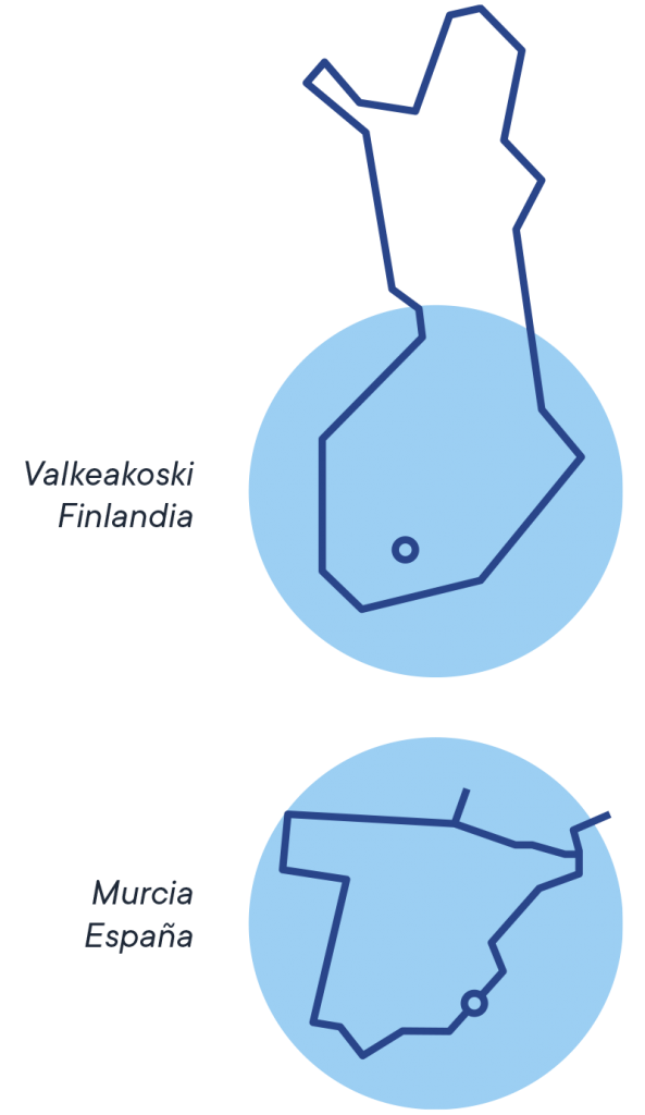
M = Murcia
N = Nature
Podría verse como una M, por el origen de Plasbel en la Región de Murcia, o como una N por la responsabilidad hacia la naturaleza. Si destaca algo en común que surge de las raíces, tanto de Walki como de Plasbel, es el respeto a la naturaleza y el desarrollo de una actividad que contribuye a una industria más responsable.

360º
360º means circularity, continuity and an integrated solution
This union aims to respond to the needs of today’s society by producing recycled, recyclable and even compostable plastic. After all, we have set ourselves the goal of a zero waste future that will allow new generations to enjoy a clean and stable environment, something we all deserve!
The shape of the logo also resembles the national flower of Finland - "Kielo (Lily of the Valley)" which symbolises the arrival of happiness, luck, youth and sincerity.
The logo's origin

ORIGEN
of both companies -
Different cultures

UNIÓN
of two companies -
Infinite possibilities

TOGETHER
under the same group -
Connected by the same line
The line of the logo symbolises
Union
Progress
Connection
Circularity
Growth
Innovation
Continuous improvement
Brand values
Natural
The use of the colour blue shows a clear commitment to nature and wellbeing. It denotes a sense of calm and peacefulness. Blue is the colour that represents the sky and the sea.
Human
The rounded, friendly and smooth lines reflect a young company that is open to everyone. We stand for dedication and commitment, always putting heart and soul into it.
Solid
The solidity of the brand reflects the strength and security of the company. A symbol that represents sustainability, progress and the energy to keep improving day by day.
Clear
Being transparent, basing personal relationships on trust and mutual respect. Always committed to ethics and honesty.
Brand colours
Walki Blue
Plasbel Blue
Starry Blue


Slogan
Sustainable
Packaging
Solutions
Walki stands out for one thing: always striving for more sustainable solutions. The group is a hub of companies whose common goal is to develop products and services that contribute to a strong circular economy and sustainability. Our ultimate goal? To achieve a zero waste future.
Walki Plasbel’s slogan focuses on our core business within the group: the development of sustainable packaging solutions. We have been working from the beginning to look for new alternatives that are increasingly respectful with the environment. Our production is based on the use of post-consumer recycled materials, reusing our own wastes to reduce the impact of our industrial activity. In short, a slogan that clearly conveys our DNA.

